

Colors and their associations are an essential vehicle for inciting emotion and communicating a company’s values. They play a vital role in branding, marketing, and product design. Understanding color association can help businesses convey the right message and evoke the desired emotional response from their audience.
As humans, we have historically assigned various qualities to colors — some of them are cultural, others rooted in evolution.
While red is often considered the color of love and passion in most parts of the world, in South Africa, for instance, it is associated with mourning and violence. Designers worldwide are tasked with navigating these relationships and skillfully using them to create meaningful experiences.
In this article, we’ll take a deep dive into color associations, their history, and the psychology behind them.
What is Color Association?
Color association refers to the emotions, perceptions, and meanings people link to specific colors. These associations are influenced by biology, culture, and personal experience. For example, while red may symbolize passion or urgency in Western cultures, it may represent mourning in South Africa. This makes understanding the psychology of color associations vital for designers aiming to connect with a global audience.
Colour Association Psychology
Color association psychology is the study of how colors affect perceptions and behaviors. It explores the emotional and psychological impacts that different colors can have on individuals, shaping their reactions and interactions with their surroundings. Understanding color psychology is essential for designers, as it enables them to create more impactful and meaningful designs by leveraging the color association meaning to elicit specific responses from their audience.
Aside from affecting the way we feel, colors impact how we behave and categorize objects in the world we live in. They provide an important context to content that surrounds us and allow us to discern what’s important in the chaos of visual stimuli.
What is the reason color associations exist at all? Why do certain shades make us react in specific ways?
The answer to these questions lies in biology and the way our brains perceive light. Simply put, light consists of elementary particles of energy called photons. Whenever these particles interact with our eyes, we experience a variety of colors, depending on their wavelength and a host of other factors.
The light we see in the morning is typically green or blue — it makes us more aware and less drowsy, while the light seen at sunset has the opposite effect.
These experiences shape the way our bodies respond to color. It’s important to mention that there are many other things that have an impact on a person’s subjective response to it. This is why we can’t confidently predict a single person’s opinion on a particular shade, but we can assume how the majority will react to it. Incorporating color association into your design can evoke specific emotions and responses from users, enhancing their overall experience and engagement.
For Application Audit
Get instant access to our complimentary UX Audit Checklist—effortless and straightforward!


Historical Context and Evolution of Color Association in Design
Colour association theory has roots in history. It’s very easy to take colors for granted. Designers and painters now have access to thousands of various hues and shades of a single color. Yet 40,000 years ago, our ancestors mixed chalk, soil, animal fat, and charcoal to create pigments which they would use to paint on cave walls and rocks. This technique allowed them to create a very basic palette that consisted of red, brown, white, yellow, and black.
In the Middle Ages, various cultures had access to a larger spectrum of colors, but at a significant cost. Back then, blue was used throughout Christian iconography to convey purity and divinity — one common example being the depiction of the Virgin Mary wearing a blue robe.

The pigment necessary to create this mesmerizing color came from a gemstone called lapis azuli, which at that time could only be found in the mountains of Afghanistan, which made it extremely expensive.
Another example of colors and their association is the case of European aristocrats that have historically used purple to communicate exclusivity and wealth because of how incredibly complicated it was to extract this pigment. The purple dye was made from mollusks that could be found in the Mediterranean. Plus, manufacturing this dye was very time-consuming — a total of 9,000 mollusks were necessary to create a single gram of purple pigment. Queen Elizabeth, I went as far as to ban anyone but the royal family members from wearing this color on their clothing.
Even though these examples reference events from hundreds of years ago, we can’t discount the effect they’ve had on the collective consciousness of different cultures. Associations with color are cultural issues that are most important for designers to consider when crafting universally resonant visual experiences.

While most people don’t necessarily know the backstory of purple dye and its production, this color is associated with wealth and luxury to this day. The same can be said about most cultural perceptions of colors— while we don’t necessarily know how these opinions were formed in our societies, that doesn’t stop us from accepting them.
That’s what makes a designer’s work with color so complicated and fascinating. Their responsibility is to take into account these diverse color associations and blend them to create meaningful experiences.

Importance Of Color Association With Design
Just as Medieval artists used rare dyes to communicate exclusivity, modern brands and products use color associations to accentuate their values. Throughout centuries, we’ve gathered an in-depth understanding of the psychology of color that helps us create usable and intuitive interfaces that solve problems and help users achieve their desired transformation.
As a part of modern design, color allows us to create experiences that are consistent both visually and psychologically. A well-thought-out color scheme can significantly improve a product, while a mediocre one will distract users and make their interaction with an interface less seamless.
Let’s take a closer look at how various brands masterfully incorporate color in their websites and advertising.
Red
Red is a hot color. It’s commonly associated with things that are violent, passionate, and intense. Some studies suggest that it can even increase our blood pressure and cause excitement. It’s no secret why so many brands use this color to craft powerful identities.
Red Color Association Examples
Pizzapizza.io is an excellent example of a website that leverages this color to craft a daring and adventurous identity. The Berlin-based product studio uses an intense shade of red as their primary color, which has a powerful effect on the observer. Their design choice is a vehicle for expressing the brand’s personality, allowing them to attract customers that fall into particular psychosocial categories.
Future London Academy's website is another example of a skillfully used bright red as the main website color. The page advertises a course on brand design and strategy for senior creatives, and their choice of red in this context isn’t accidental. It’s a symbol of the love and passion their target audience has for the craft.

Red is also a popular choice in advertising. While the websites above used red to express passion, Tylenol’s ad is an excellent example of how it can be used to express pain and intensity.

While these adverts feature a wrecking ball and a bunch of staples to allude to the physicality of pain, the intense red background definitely helps get the point across.
Blue
Blue, like red, is a very diverse color. It’s a common reference to stability, peace, and calm when integrated correctly into a brand’s identity. At the same time, there are many negative things we associate blue with—depression, sadness, and coldness.
This color is very popular with tech brands; it’s safe to assume that it references technology’s stability and lack of emotion. A few popular examples are Facebook, Twitter, Zoom, and Telegram. These companies’ use of blue instills a sense of confidence and reliability.
Blue Color Association Examples
Wireless Social’s use of the color is pretty creative. Their website features a gradient of blue that transitions into white, which can be treated as somewhat clinical. However, the fact that the service provides hospitality and retail businesses with data-driven insight that helps them increase foot traffic and conversions, it all starts making perfect sense. Their choice of color underlines the analytical and impersonal qualities of the software they provide.
Techgami’s website is another testament to the sense of stillness and confidence that blue communicates. This is a team of specialists that assists companies with their digital transformation efforts.
Our next example features blue as a symbol for depression and sadness. This is an ad for an Australian mental health organization called “Beyond Blue.”

The organization leverages both the word’s meaning and the color’s symbolism to underline the nature of its services.
Green
Green is all about nature, fertility, money, and growth. It’s an extremely popular choice among companies in the healthcare and agriculture industries.
Lighter shades of green are commonly used to convey freshness, while darker tones are typically associated with stability and wellbeing.
Green Color Association Examples
Slow is a collective of people that explores the ways humans can interact with their surroundings that aims to positively impact the world we live in. While their website doesn’t explicitly use green in their branding or typography, it presents users with a variety of images that feature various shades of this color—instantly establishing its dominance. Without even reading the project’s “About Us” page, it’s clear that their activity revolves around nature and its preservation.
Medwest.plus is a German clinic that cleverly combines an X-ray’s dark-green tones while also using the color to communicate stability and prosperity. This is an excellent choice for a brand in this particular sector since nobody enjoys dealing with health issues. Medwest’s choice of color makes their customers’ interaction with their site a more calming and joyful experience.
A great example of an advertisement that uses green to symbolize harmony with nature (sic) is BP’s campaign that features glow-in-the-dark phosphorescent ink. During the day, these adverts absorb sunlight, which allows them to glow at night without using electricity.

Yellow
The most common things yellow is associated with are sunshine, happiness, and optimism. Brands often use this color to appear more welcoming and cheerful.
Yellow Color Association Examples
Elliot.store's yellow-heavy branding is an excellent example of how this color helps convey cheerfulness and motivation. They pair their color palette with a very lively and excited tone of voice by using unusual CTAs like “Poof, you’re in business” and “Let’s gooo.”
The way Markit uses yellow is slightly toned down compared to Elliot. The color they use is a bit reserved and less intense, which is in tune with their brand identity. Their shade of yellow conveys optimism rather than Elliot’s cheerful and exciting use of the color.
The same can be said about Mailchimp’s approach. This particularly saturated yellow has long been part of the brand’s recognizable identity. And yet again, this email marketing platform’s choice of colors is supported by their very friendly tone of voice and overall experience.

Orange
Orange is a combination of red’s intensity and yellow’s excitement. We commonly associate it with comfort, warmth, and wellbeing. Depending on its intensity, orange can stand for motivation, enthusiasm, and fun.
Orange Color Association Examples
Headspace’s 2016 outdoor ad campaign is a great combination of the qualities we mentioned above. The popular meditation app touches on how a regular mindfulness practice can positively influence the life of practitioners.

The orange these ads feature feels very comfortable and inviting, just like the sought-after effects of meditation.
Click and Rent is a French rental platform that uses orange as its main color. This allows them to underline the excitement associated with moving into a new home rather than presenting it as an ordeal.
Political Playlist uses orange to make the topic of politics less dull. While many of us may label political debates, legislation, and statistics as a very boring endeavor, the service’s branding immediately turns this into an exciting journey we’re all waiting to embark on.
Violet
As we mentioned previously, violet is commonly associated with royalty and luxury. On the other side, this color is often linked to power and spirituality. We’ll explore both of these sides in the examples below.
Violet Color Association Examples
Evoca is the first digital bank in Armenia. Their palette features lots of violet that aims to convey exclusivity and reliability. The shade the bank uses in its branding feels exciting and engaging.
On the other hand, we have Youth Justice, an organization that aims to break cycles of incarceration, provide young people with individualized advocacy, and dismantle inequity in the justice system. The organization’s use of violet is a clear reference to the emotional and psychological strength necessary to combat inequality.
White
White is the epitome of innocence, kindness, and humility. Some of the negative connotations of the color are often linked to sterility and emptiness.
It’s somewhat complicated to talk about this color without touching on “whitespace." While whitespace isn’t necessarily white in all cases, it most commonly is. We rarely think of it as a “dominant” color since it’s often seen as a supporting actor — the space between elements. However, we can always identify when white is used with intention.
White Color Association Examples
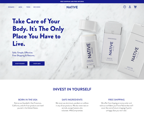
One example of branding where this color becomes the star of the show is Native’s packaging. Cosmetics brands use plenty of white to present their products as pure and clean.
Our following example is Fontshare — a website that offers a continuously growing collection of professional-grade fonts for free. Compared to the example above, white is explicitly a medium on which elements exist, rather than the focus of the design.
Black
Black is the color of mystery, power, and elegance. However, it can also be associated with sadness, evil, and mourning. It’s an exceptionally popular color in the fashion industry.
Like white, black can act as a medium in which objects exist. However, compared to white, it creates a sense of intimacy and comfort.
Black Color Association Examples
Climatehistory.org is an example of a website that uses black to instill a sense of sadness and gravity related to the topic of climate change. The site explores critical historical milestones that had a massive impact on our environment.
Androll's website has a monochromatic palette that uses black as the background on which events take place. However, due to the context, rather than appearing somber, their page reflects the brand’s passion for nightlife, where darkness is a place of comfort.
Using Color Associations For Websites
Most websites on the internet have an ulterior motive — conversions. Brands create highly usable and well-designed websites to see an increase in their sales or exposure. Choosing the right colors for your brand’s website is a vital step in ensuring that the members of your target audience will gradually become your customers.
Finding the right colors for your brand isn’t easy, but fortunately, there’s a set of principles that will help you narrow down your choice:
- Explore color associations
- Take a closer look at your competitors’ palettes and make sure the colors you choose don’t overlap with theirs
- Make sure that the colors you’ve selected reflect your corporate identity
- Analyze your target audience to further narrow down your choice. There can be a variety of cultural factors that can influence a person’s perception of colors
- Your branding colors should reflect the industry you’re in
- Test and iterate — combine the colors you’ve selected and make sure that they convey they communicate your values
An identity that matches your target audience’s preferences and your industry standards will allow you to create a lasting connection with your customers.
But, there’s more to conversions than mere color palettes — call to action (CTA). CTAs are the buttons websites use to direct their visitors towards their goal conversions.
There are many schools of thought when it comes to the optimal CTA button color. Some say that red and blue are the best performers in this category. Others suggest that green, orange, and yellow are serious contenders to the previous two.
One thing is for sure — your CTAs must be compatible with your color palette. More importantly, choosing a color for your calls-to-action should always be preceded by rigorous A/B testing.
The colors that are commonly considered poor performers in this category are black, white, and brown due to a lack of warmth and action — they don’t motivate users. However, it’s important to underline that these ideas should be considered guidelines, not immutable rules. Choose whichever color works best for your site.
FAQs About Color Association
Q1. What is the theory behind colour association?
The colour association theory suggests that both evolutionary biology and cultural upbringing shape our emotional reactions to colors. This theory is key in fields like marketing and user experience design.
Q2. What is the psychology behind associating colors with people?
Color association with people examines how colors influence perceptions of individuals—for instance, someone wearing black might be seen as confident or mysterious.
Q3. How do brands use color association in marketing?
Brands use color associations to tap into psychological triggers. For example, fast food chains often use red to stimulate appetite and energy.
Q4. How does color association affect user behavior?
Color association psychology influences where users look, how they feel, and what actions they take—such as clicking a button or trusting a product.
Q5. Why is it important to consider color association with people when designing for global audiences?
Because colour association with people varies by region, failing to localize colors can result in misinterpretation or reduced engagement.
Q6. What are some poor-performing CTA button colors?
Studies suggest that colors like black, white, and brown typically underperform as CTAs due to a perceived lack of urgency or warmth. However, this varies depending on context and contrast.
Q7. What’s the difference between colors association and color theory associations?
Colors association is about emotional links to colors, while color theory associations involve relationships between colors on the color wheel (e.g., complementary or analogous colors).
The bottom line
Your business’s identity is how your customers will see your brand. Color is an essential component of that. While color psychology is a complex and ever-evolving topic, it’s important to underline that finding the best colors to represent your brand’s identity isn’t as complicated as it seems. Good luck!
- #DesignSpecification
- #UIDesign
- #VisualDesign

Abdul has helped over 40 Fortune 500 companies make informed user-centered design decisions through evidence-based user research and UX best practices. As an Adjunct Professor, Abdul has taught in DePaul University’s graduate UX programs and for nine other universities.


