

It’s been shown that good UX design can increase an application product’s profits astronomically. All UX teams make mistakes occasionally, but even a misplaced button or a little unclear text can make or break profits. Look out for the eight common mistakes below when trying to increase your app’s profitability. Design teams that can recognize and fix these mistakes are well poised to make better products that turn significantly higher profits.
What is App Profitability?
App profitability refers to the ability of a mobile application to generate revenue that exceeds its development, maintenance, and marketing costs. It is a key metric for assessing the financial success of an app and is influenced by various factors, including user acquisition, engagement, retention, and monetization strategies. Understanding app profitability involves analyzing not just the initial earnings but also the long-term financial performance and sustainability of the app.
Key Components of App Profitability
1. Revenue Streams
- In-App Purchases (IAPs): Users buy virtual goods, premium features, or additional content within the app.
- Subscriptions: Recurring payments from users for continued access to app content or services.
- Advertisements: Earnings from displaying ads within the app, which can be based on impressions, clicks, or conversions.
- Paid Apps: One-time purchase fee to download and use the app.
2. User Acquisition
- The strategies and costs associated with attracting new users to download and install the app. Effective marketing campaigns, app store optimization (ASO), and positive user reviews play a crucial role here.
3. User Engagement
- The degree to which users interact with the app and utilize its features. High engagement often leads to increased in-app purchases and ad revenue.
4. User Retention
The ability to keep users returning to the app over time. Strong retention rates are essential for sustaining revenue, as acquiring new users is generally more costly than retaining existing ones.
5. Lifetime Value (LTV)
- The total revenue a business can expect from a user throughout their relationship with the app. A higher LTV indicates better profitability.
6. Customer Acquisition Cost (CAC)
- The cost incurred to acquire a new user. Profitability is maximized when the LTV significantly exceeds the CAC.
Importance of UX in App Profitability
User experience (UX) directly impacts all components of app profitability. A well-designed app with intuitive navigation, appealing aesthetics, and seamless functionality encourages users to engage more, spend money on in-app purchases, and remain loyal to the app. Conversely, poor UX can lead to high churn rates, negative reviews, and decreased revenue.
For Application Audit
Get instant access to our complimentary UX Audit Checklist—effortless and straightforward!


Optimizing User Experience to Enhance App Profitability
By focusing on optimizing the user experience and avoiding common UX mistakes, developers and businesses can enhance user satisfaction, improve retention rates, and ultimately drive higher app profitability. Below, we dive into some of these common UX mistakes and how addressing them can significantly benefit your app’s financial performance.
1. Content Isn’t Concise
Novels with 500 pages can get away with it, but in the digital product world, it’s important to keep copy short and to the point. Large blocks of text, big words, or subjects that are too specific or confusing for your general audience, all contribute to bad web content. It follows that the customer experience is not up to par when readers are subjected to long and dense passages of text when all they really want to do is quickly buy something. Of course, most consumers would probably just abandon the app or website resulting in abandoned profits for your product.

Things you can do:
- Break up large blocks of text with headers and subheads,
- Use web-friendly fonts,
- Don’t write a whole lot, and
- Review UX4Sight’s AT&T Case Study as an example of wrangling content for the good of the user experience
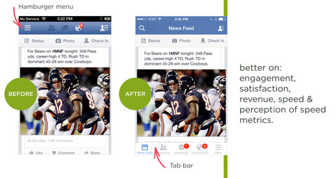
2. Being Trendy
What’s popular isn’t always right, and the same goes for hamburger menus, carousels, and probably a dozen other trends that were started and subsequently copied by nearly every product out there. Performing A/B testing with different designs that perform the same function might give your team surprising insights into how users will more willingly interact with your app, leading to more profits.
For example, Facebook may have invented the hamburger menu, but they actually saw performance increase when they stopped burying items in the hamburger menu.

3. Lengthy Forms or Checkout Processes
You know what’s almost always terrible? Filling out a form. So please, don’t make them worse with unnecessary fields. Form fields, ads, or pop-ups that don’t contribute to the task at hand not only hurt the customer experience, but can turn customers off to completing their transaction.

Source: https://theblog.adobe.com/designing-more-efficient-forms-structure-inputs-labels-and-actions/
Asking for too much personal information and trying to cram marketing information like email subscriptions, lead to a long checkout process that could hurt your profitability. What’s ironic is that teams do these things because they think it furthers the business – by adding email subscriptions to grow their audience, gathering lots of customer data for future use, or partnering with many advertisers at once. But in the end, customer experience suffers greatly.

For the SeaWorld Parks project, our senior leadership streamlined the path-to-purchase for guests on 8 SeaWorld park websites.


The process of reducing complexity by only presenting information relevant to the current context.

4. Mobile Comes Second
The rules of mobile app design are different, and it’s well documented that your revenue will be impacted in a good way if you design responsive apps and websites that fit the device sizes of your target audience. UX Designers often think of mobile design as coming first, before desktop size screens, since many customers are now purchasing and carrying out complex transactions on just their smartphones. Mobile optimized sites will also rank better in search results, ensuring that your web app is ahead of the competition and is better positioned to capture those paying customers.
Having a responsive website, like the example below, is one way to ensure all screen sizes display your application perfectly.

5. Designing for Yourself
If your web app UX designers are saying things like “well, I would probably click here first,” when talking about how they would use your app or website, then something is very wrong. Designing for yourself is an easy mistake to make in an app design, and also the quickest way of churning out new designs. So, it’s understandable that many web app design teams think about themselves more like the end user. Sometimes, teams fall into “groupthink” without any experienced moderators or leaders at the discussion. So, it’s easy to justify UX features by saying that they work for everyone in the room.
But who’s not in the room? Probably your actual audience. The ones who pay to keep your app in business. Your user base probably has different demographics, interests, frustrations, and more compared to the app design team. Ensure that, through initial user research, your UX design team gets a good sense of who they will be designing for before jumping into creation.
6. Ignoring Web Performance
Imagine trying to check out of an ecommerce store, but nearly every page in the checkout process is buggy or slow? This alone can stop a purchaser from buying that thing you claim to sell so well. Web performance is not just something that developers need to think about, but designers need to as well. Ensuring that your UX Designers understand the importance of lightweight design and power-packed features that load quickly, don’t clog up computer memory, and won’t crash are essential to a quality web application design.

The worst are home pages that take too long to load. In general – research shows that website and app users will take just a few seconds to decide if the page they’re looking at is useful or not. Pages that don’t load quickly enough are not user friendly if the user will leave the experience altogether.
7. Designing Before Researching Your Users
Designing a prototype with little or no background research on your user base will lead to, initially, a useless prototype. UX 4Sight’s leadership recognized this and led transformative user research sessions for Epic (a leading Electronic Health Records software company) with the application and the physicians that use it to boost application design insights. Without the proper user research and insights, you most likely will not get the sales or transactions you had expected. This of course hurts app profitability from the start, not only from the customer facing side, but the extra time, effort, and resources needed to fix errors in either design or development.
8. Becoming Accustomed to Any of the Above
Getting used to a poor UX design routine is a great way to never realize all of the profits you’re missing out on. If your team is not actively trying to fix things and learn every day, change becomes harder over time. Learning new design methods and staying on top of the industry are essential for designing applications that churn profits. Our senior leadership can help your staff learn how through UX Training, as done with clients like Disney, IBM, IRS, Intuit, Boeing, and Blue Cross Blue Shield. Learn more.
How UX 4Sight Can Help: Your Partner in App Profitability
At UX 4Sight, we understand the critical role that user experience plays in the success of an app. As a bespoke app design agency, we specialize in creating custom solutions that meet the unique needs of your business and target audience. Here’s how we can help enhance your app’s profitability:
1. Comprehensive UX Audits
Our team conducts thorough UX audits to identify and address any issues that may be hindering your app's performance. We evaluate your app’s usability, design, and overall user experience to pinpoint areas for improvement. This detailed analysis helps us provide actionable insights and recommendations tailored to your specific goals.
2. Tailored UX Design Solutions
We believe in creating user experiences that are as unique as your business. Our bespoke design services are customized to fit your brand identity and user needs. By focusing on intuitive navigation, responsive design, and aesthetically pleasing interfaces, we ensure that your app provides a seamless and enjoyable experience for users.
3. Streamlined Onboarding Processes
First impressions are crucial. Our experts design onboarding processes that are simple, engaging, and effective, ensuring that new users understand the value of your app quickly and are motivated to continue using it. This reduces churn rates and enhances user retention from the start.
4. Content Optimization
Content plays a vital role in user experience. We help you craft concise, clear, and compelling content that resonates with your audience. By breaking up text, simplifying language, and focusing on user intent, we make sure your app’s content enhances rather than hinders the user experience.
5. Performance Optimization
Slow loading times and performance issues can drive users away. Our team works to optimize your app’s performance, ensuring fast loading speeds and smooth functionality. This not only improves user satisfaction but also boosts retention rates and profitability.
6. Continuous Improvement and Support
The digital landscape is always evolving, and so are user expectations. We provide ongoing support and iterative improvements to ensure your app remains competitive and continues to meet user needs. Our commitment to continuous improvement helps you stay ahead of the curve and maintain high levels of user satisfaction.
Partner with UX 4Sight for Success
At UX 4Sight, we’re dedicated to helping you achieve your business goals through exceptional user experience design. By partnering with us, you can ensure that your app not only meets but exceeds user expectations, leading to higher engagement, improved retention, and increased profitability. Let us help you create an app that stands out in today’s competitive market.
For more information on how we can transform your app’s UX and boost its profitability, contact us today. Together, we can create a user experience that drives success.
- #ApplicationDesign
- #ROI

Abdul has helped over 40 Fortune 500 companies make informed user-centered design decisions through evidence-based user research and UX best practices. As an Adjunct Professor, Abdul has taught in DePaul University’s graduate UX programs and for nine other universities.


